Just for Fun: Our Original Logo
If you can't laugh at yourself, you're taking yourself far too seriously.
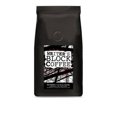
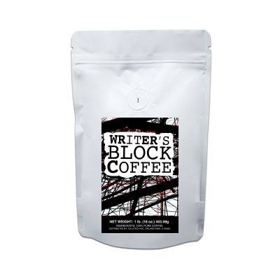
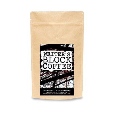
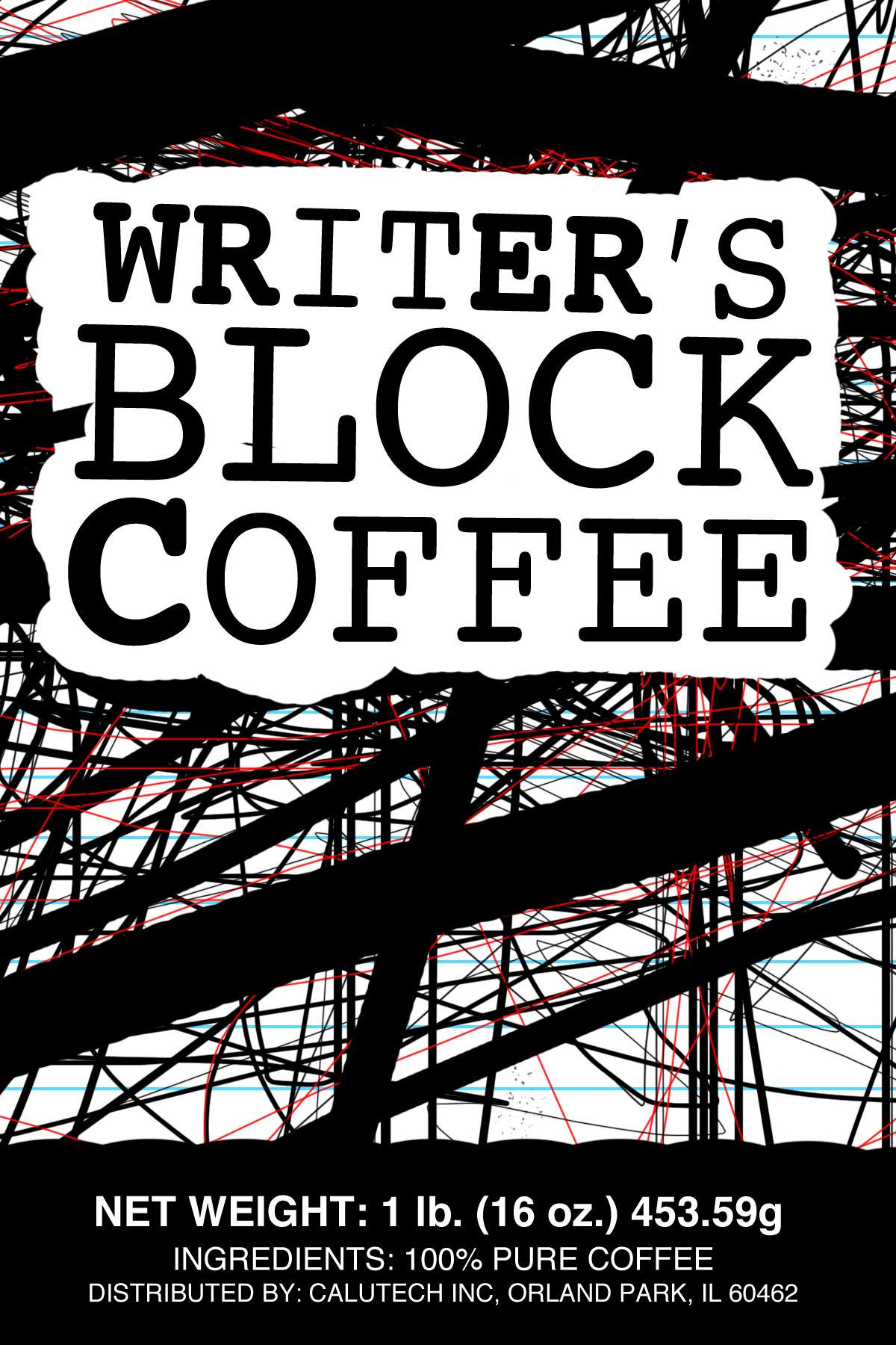
Case in point: the original Writer's Block Coffee logo looked like something stuck to a Trapper Keeper from the 1990s. If you don't know what a Trapper Keeper is, it was also something from the 1990s.

Things did not improve when applied to a bag of coffee beans.


The thing about logos is that they need to do several things:
- Exist
- Look recognizable at different sizes
- Be versatile
And the thing about this first attempt is that it achieved none of that.
Thankfully, this was not the last attempt. The current, simpler version checks those three boxes.
However, if anyone needs a design for an After School Special reboot, you know where to find me!
~Ben

